Wednesday, 18 December 2013

David LaChapelle Case Study

David LaChapelle is an American photographer, music video director and film director (born March 11, 1963) and he is mostly known for his photography because his photography is unique and can be defined as "hyper-real and slyly subversive". He has worked with numerous famous people including Tupac Shakur, David Beckham and Leonardo DiCaprio, and his work has been on the front covers of GQ, Rolling Stone, Vogue Paris and many more. David LaChapelle is so good at what he does that he is able to influence the work of a new generation of photographers.

At a very young age David LaChapelle said that he loved the schools which he attended in Connecticut even though he suffered from bullying and at the age of fifteen he was bullied for being gay which resulted in him running away to New York City and during his time there he became a busboy at Studio 54. However, during the 1980's he earned his money through prostitution so that he was able to buy his photography equipment.

Some example's of David LaChapelle's work:

         Eminem covered in graffiti                                                                 Michael Jackson as an Angel

Wednesday, 11 December 2013

Double Page Spread Analysis

Genre Double Page Spread
  • The main feature of this double page spread is the artist, Drake

  • The main image does dominate both pages even though the artist is placed only on the left.
  • The image is represented by the artist wearing a shirt, jeans and a chain.
  • The size of the image is large as it covers both pages.
  • The image is shot by using a mid-shot since it does not show the whole of him.The reader might see the picture and want to continue reading because Drake is a very well-known artist in the R&B genre and is appealing to a lot of people nowadays.
  • There isn't a headline in this double page spread
  • The pull quote in this is 'Introducing the month's hottest talent...' which is obviously talking about the artist.
  • Even though the image isn't really clear, it does use a drop cap which entices the reader because it stands out to the other texts.
  • There is no byline used in this double page spread.
  • The columns for the body text is equal in width and is kept on the right hand page.
Other Music Double Page Spread
  • The main feature on the double page spread is the artist, Lupe Fiasco.
  • The image dominates the left hand page only.
  • The image is represented by the artist wearing a black hoodie and a gold watch which can represent the type of music genre he is in.
  • The size of this image is large because it covers one whole page and it is captioned by 'FIASCO@9:30'
  • The type of shot used for this image is a mid shot because it shows half of his body and the reader might see the picture and want to continue reading because Lupe Fiasco is a well-known rapper and people might want to read about him and what he's been up to.
  • The headline is also 'FIASCO@9:30' and it uses the symbol '@' instead of 'At' because it is shorter and easy to read.
  • The pull quote for this double page spread is "Struggle is another sign that God loves you/'Cause on the low, being poor makes you humble" and the colours used for this is gold and white so that it stands out from the background.
  • Even though the size of the text is quite small, there is a lot of text which takes up half of the right hand page.
  • The columns for the body text is equal in width and it is used only on the right hand page.
  •  


Thursday, 28 November 2013

Music Magazine Case Study

Genre Research- RnB

This is a music magazine called RnB and it is obviously based on the music genre RnB. Also on the front cover of this magazine it features the artist Bridget Kelly who is widely known for being in this music genre and by doing this then the magazine will sell more since nearly everyone who is interested/associated with this type of music knows her.
Furthermore, the masthead of this magazine catches the eyes of the public because it is orange  which makes it stand out from anything else on the front cover as the rest is dark.
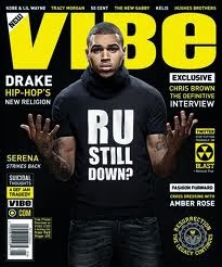
This is another type of RnB music magazine called VIBE and it features another very famous musician Chris Brown and just like the other magazine they used an artist that everyone knows in order to sell more copies of this magazine. 


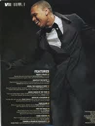
This is a contents page (shown on the left) from an issue of VIBE. The contents page consists of Chris Brown yet again but he is dressed in a more formal and sophisticated way which is different in the front cover. Also, the page is mostly taken up of the image of Chris Brown even though there is a lot of text but the size of the text is small and this shows that the magazine is organised and neat. Furthermore, the colours used in this contents page is very plain as it is just black and white, however by putting these two colours together then it makes each of them stand out as they are of different contrasts. 


Wednesday, 27 November 2013

Moodboard & Analysis


Analysis

This moodboard represents the R&B music genre, it includes images of some of the people who are widely known and mostly associated with this particular genre such as Justin Timberlake, R.Kelly and Chris Brown. Also, the other people that are used in this moodboard are people that R&B is targeted at which are teenagers and young adults and this shows these kinds of people dancing or just hanging out.

Thursday, 14 November 2013

Music Magazine- Planning Sheet


  • What genre/s of music will your magazine cover?
 The genre of music that my magazine will cover is R'n'B.
  • Who is the target audience? How old are they? Where do they live? What are their interests?
The target audience for my music magazine will be aimed at male and female teenagers aged16 and over.
  • What is the name of your magazine? Why? Connotations?
The name of my music magazine will be 'Flow'.
  • What will your masthead look like? Do you have any ideas for fonts? (this should be accompanied by sketches)
The masthead of my music magazine will be a bold font with the use of the colour gold as it represents the music which is being produced within this genre.
  • What will be the focal image for your front cover and why?
The focal image for the front cover of my music magazine will feature a popular musician that everyone will easily recognise such as Chris Brown.
  • What photography will be required? Give details of shot type, angle and composition.
The type of shot that I will use for the image for the front cover of my music magazine will most likely be a mid-shot of the artist with them being placed in the centre in front of a plain background so that they are able to stand out and catch the target audiences attention.
  • What mise en scene will be required? Location? Clothing? Make up? Lighting? Use of colour?
The mise-en-scene that will be required is smart or casual clothing that R'n'B artists will usually wear, also the location that the image will be taken in will be in front of a plain white background with minimal make up and a bit of lighting to emphasise the artist.
  • What would be your sell lines? How will you entice your target audience?
The sell lines for my music magazine front cover will try to persuade the target audience to pick up the magazine and will include important and recent information relating to the main musician being featured and other artists so that they know what is happening within the genre.
  • What items and feature articles would you need on your contents page?
The items and feature articles that my contents page would need is the artist performing and also a banner that is a competition for the readers where they will be able to win tickets to see the musician perform.
  • What is the focus of your double page spread? (interview? feature? reviews? etc)
The focus of my double page spread will be an interview of the main artist being featured on the front cover which will talk about their new album and other projects that the person is working on.
  • What photography will be required for the double page spread? Give specific details.
The type of photography that will be required for the double page spread will be focusing on the main artist but will also include a group of artist that is in the same genre and will also give minimal information about them as well.

Wednesday, 13 November 2013

Analysis of Two Magazine Covers- Michael Jackson

The image has been cropped to show the artists top half of the body. Also, the type of shot that has been used is a mid-shot and this is to present Michael Jackson's body language which looks like he is very calm and relaxed.

The type of costume that is being used is quite simple as the artist is just wearing a striped t-shirt and this could suggest that he is just a normal person. 

There are no props being used.

Telling by the background, the setting could probably be a studio as it is just plain white which could mean that he is not very outgoing in terms of his personality and that he wants to remain an ordinary person.

The colours that are being used on this front cover are red and white, this can reflect the artist as being very calm.


The image has been cropped around Michael Jackson's face and the type of shot that is being used is a close up, this is to show how the musician is feeling and the readers are able to see his facial expression which shows that he is depressed.

Since we cannot see Michael Jackson's full body, we can only see from his neck upwards and it looks like that he is wearing a type of scarf which is the only part of clothing that is being presented. This could suggest that he is feeling insecure as he is trying to cover himself up.

Just like the first magazine there are no props being used.

The setting of this image could possibly be outside because the colour of the background is green which can represent nature, also another thing that could suggest that this is outside is that his hair is being blown across his face which is being done by the wind.

There are only two colours being used and they are black and green. These colours were used because it is another way on how the person is feeling and also this was published after his death which was his final and darkest days.

Wednesday, 9 October 2013

Angels Magazine Analysis

 The front cover of 'Angels' magazine is very colourful and the first thing catches the reader's attention is the masthead because of the colours being used and the size of the font as it is larger than the other texts with the smallest size font being of the date and the price which can be found on the left under the masthead. This magazine also includes a headline, 'Survival Guide For GCSE Technology', it relates to the image being used on the front cover since the model is wearing an apron, holding a wooden mallet and the expression on her face could tell us that she is stressed or frustrated. There are also a few sell lines on here which might draw their target audiences attention, some of them are 'Towie', 'Bieber' and 'Summer Accessories'. Another feature that can draw attention is the banner because it says that they could possibly win a voucher, albums, perfume and sweets.

The contents page of the 'Angels' magazine has a different theme to the front cover since it uses flowers and a different styled font for the text but does not have any images related to the magazine itself which can make this whole page look plain. However, since it does not have an image, they use the space very well by having a lot of text such as the date and the issue number of the magazine. The subjects of the magazine have been separated into four groups with them being 'fashion & beauty', 'reviews', features' and 'also', however it does not have any page numbers for where the reader should go to if they want to read a specific thing. The overall theme of the contents page is  making it clear that it is mainly aimed at girls because of the use of the flowers, the 'fashion & beauty' and also on the bottom left of the page it says ' I Love Angels. 

Wednesday, 2 October 2013

Magazine Cover Pencil Sketch


Magazine Idea

My idea of what my magazine may look like is that it will be about school with the title of the magazine being 'Achieve' because it is simple but effective.
 The main content for this magazine will be about Sixth Form and how to survive it. Also, the model for my magazine front cover will be someone dressed in a formal attire in a library standing in front of a book shelf either holding books or taking out books since it shows that they are ready to study, my front cover will include the obvious features that a magazine should have and they are sell lines, headline, issue number etc.
The type of shot that I will use for the photo will be a mid-shot because it will allow people to see what the person is wearing, their surroundings and to clearly show what my model is doing.
 Moving onto sell lines, there will be things that would make people want to read the magazine such as interviews with the Sixth Forms top students and things that will help students get through their A-Levels. The contrast of my model standing in a library with books and wearing a formal dress code is that it indicates that they are ready to be successful.