Thursday, 28 November 2013
Genre Research- RnB
This is a music magazine called RnB and it is obviously based on the music genre RnB. Also on the front cover of this magazine it features the artist Bridget Kelly who is widely known for being in this music genre and by doing this then the magazine will sell more since nearly everyone who is interested/associated with this type of music knows her.
Furthermore, the masthead of this magazine catches the eyes of the public because it is orange which makes it stand out from anything else on the front cover as the rest is dark.
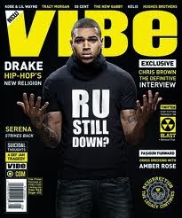
 This is another type of RnB music magazine called VIBE and it features another very famous musician Chris Brown and just like the other magazine they used an artist that everyone knows in order to sell more copies of this magazine.
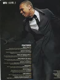
 This is a contents page (shown on the left) from an issue of VIBE. The contents page consists of Chris Brown yet again but he is dressed in a more formal and sophisticated way which is different in the front cover. Also, the page is mostly taken up of the image of Chris Brown even though there is a lot of text but the size of the text is small and this shows that the magazine is organised and neat. Furthermore, the colours used in this contents page is very plain as it is just black and white, however by putting these two colours together then it makes each of them stand out as they are of different contrasts.
Furthermore, the masthead of this magazine catches the eyes of the public because it is orange which makes it stand out from anything else on the front cover as the rest is dark.
 This is another type of RnB music magazine called VIBE and it features another very famous musician Chris Brown and just like the other magazine they used an artist that everyone knows in order to sell more copies of this magazine.
  This is a contents page (shown on the left) from an issue of VIBE. The contents page consists of Chris Brown yet again but he is dressed in a more formal and sophisticated way which is different in the front cover. Also, the page is mostly taken up of the image of Chris Brown even though there is a lot of text but the size of the text is small and this shows that the magazine is organised and neat. Furthermore, the colours used in this contents page is very plain as it is just black and white, however by putting these two colours together then it makes each of them stand out as they are of different contrasts.
 Wednesday, 27 November 2013
Moodboard & Analysis
Analysis
This moodboard represents the R&B music genre, it includes images of some of the people who are widely known and mostly associated with this particular genre such as Justin Timberlake, R.Kelly and Chris Brown. Also, the other people that are used in this moodboard are people that R&B is targeted at which are teenagers and young adults and this shows these kinds of people dancing or just hanging out.
Thursday, 14 November 2013
Music Magazine- Planning Sheet
- What genre/s of music will your magazine cover?
- Who is the target audience? How old are they? Where do they live? What are their interests?
- What is the name of your magazine? Why? Connotations?
- What will your masthead look like? Do you have any ideas for fonts? (this should be accompanied by sketches)
- What will be the focal image for your front cover and why?
- What photography will be required? Give details of shot type, angle and composition.
- What mise en scene will be required? Location? Clothing? Make up? Lighting? Use of colour?
- What would be your sell lines? How will you entice your target audience?
- What items and feature articles would you need on your contents page?
- What is the focus of your double page spread? (interview? feature? reviews? etc)
- What photography will be required for the double page spread? Give specific details.
Wednesday, 13 November 2013
Analysis of Two Magazine Covers- Michael Jackson
The image has been cropped to show the artists top half of the body. Also, the type of shot that has been used is a mid-shot and this is to present Michael Jackson's body language which looks like he is very calm and relaxed.
The type of costume that is being used is quite simple as the artist is just wearing a striped t-shirt and this could suggest that he is just a normal person.
There are no props being used.
Telling by the background, the setting could probably be a studio as it is just plain white which could mean that he is not very outgoing in terms of his personality and that he wants to remain an ordinary person.
The colours that are being used on this front cover are red and white, this can reflect the artist as being very calm.
The image has been cropped around Michael Jackson's face and the type of shot that is being used is a close up, this is to show how the musician is feeling and the readers are able to see his facial expression which shows that he is depressed.
Since we cannot see Michael Jackson's full body, we can only see from his neck upwards and it looks like that he is wearing a type of scarf which is the only part of clothing that is being presented. This could suggest that he is feeling insecure as he is trying to cover himself up.
Just like the first magazine there are no props being used.
The setting of this image could possibly be outside because the colour of the background is green which can represent nature, also another thing that could suggest that this is outside is that his hair is being blown across his face which is being done by the wind.
There are only two colours being used and they are black and green. These colours were used because it is another way on how the person is feeling and also this was published after his death which was his final and darkest days.
Subscribe to:
Comments (Atom)


