Wednesday, 29 January 2014

Two Other Contents Page Analysis


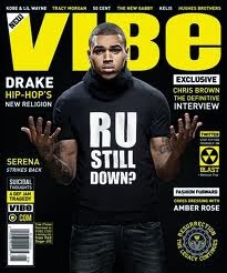
 The main image for Vibe is also the background of the artist Ciara. Whereas the main image for Q is of Adele which is a close up shot and is only taking up about a quarter of the page.

There are no subsidiary images used in Vibe's contents page, while the subsidiary image in Q's contents page is shown at the bottom.

There is also no summarised information about what is going on in Vibe magazine. However, there is summarised information on Q's contents page and this is at the bottom of the page where it says 'Review'.

There are no parts of Vibe's contents page that are sectioned off, whereas in Q there are bits that are sectioned off such as the 'Features' part and the bit where it says 'Every Month' on the bottom left of the page.

The page number for Vibe's contents page is presented on the bottom right of the page in a very small sized font but there is no page number for Q's contents page.

For both Vibe and Q's contents page there are no promotional features presented on them.

The logo for Vibe is not shown on their contents page but there is a white outline of the letter 'V' shown at the top of the page. However, the logo for Q magazine is presented in numerous places on their contents page for instance at the top left of the page next to where it says 'Contents' and below the main image next to where it says 'Review'.

There is no issue number for Vibe magazine's contents page. However, I believe that the issue number for Q magazine is on the top right hand side of the page next to the date where it says '262'.

For both Vibe and Q magazine contents page there are no letter from the editor.

The colour scheme for Vibe magazine is black and white since the background goes from black, grey then white and the clothing worn by the model is the same colour as the background, also the colour of the font being used either black or white. However, the colour scheme for Q magazine is red, black and white since the logo of the magazine is red and the font colour is black and there are some white parts.

XXL Contents Page Analysis


  • The main image for this contents page is of Dr.Dre which is also being used as background for the text. The main image is in black and white so that it suits the colour scheme of the magazine. 
  • There are no subsidiary images used in this contents page.
  • There is also no summarised information about what is on the mag.
  • There is only one bit that is sectioned off from the rest which is shown on the top bit of the page where it has the number 58. This is because it lets the readers know that it is the most important bit.
  • The page number is shown in the bottom left of the page in a very small sized font.
  • There are no promotional features for this contents page.
  • The magazine logo is shown on the top right hand side of this page next to the date/month where it says XXL. It uses red and white so that it stands out and it can be recognised by the readers.
  • There is no issue number for this contents page but there is a date which is placed underneath the masthead, 'the A-side'
  • There is also no letter from the editor for this contents page.
  • On this contents page it shows the editorial team for this issue, this is shown at the very bottom of the page on a black banner so that it lets people know that it is separate from the rest. 
  • Furthermore, the colour scheme for this contents page is very simple but it is organised in a very good way. The colours used in this are black, red and white with the colour black being the more dominant of the three especially in the image where the artist (Dr.Dre) is wearing all black clothing.


Wednesday, 22 January 2014

DPS Draft

This is a draft of my DPS which shows that my model will be placed only on the right hand side and on the left hand side it will be all text where the article will be talking about an upcoming music artist who wants to make a name for himself in the RnB genre.

Wednesday, 18 December 2013

David LaChapelle Case Study

David LaChapelle is an American photographer, music video director and film director (born March 11, 1963) and he is mostly known for his photography because his photography is unique and can be defined as "hyper-real and slyly subversive". He has worked with numerous famous people including Tupac Shakur, David Beckham and Leonardo DiCaprio, and his work has been on the front covers of GQ, Rolling Stone, Vogue Paris and many more. David LaChapelle is so good at what he does that he is able to influence the work of a new generation of photographers.

At a very young age David LaChapelle said that he loved the schools which he attended in Connecticut even though he suffered from bullying and at the age of fifteen he was bullied for being gay which resulted in him running away to New York City and during his time there he became a busboy at Studio 54. However, during the 1980's he earned his money through prostitution so that he was able to buy his photography equipment.

Some example's of David LaChapelle's work:

         Eminem covered in graffiti                                                                 Michael Jackson as an Angel

Wednesday, 11 December 2013

Double Page Spread Analysis

Genre Double Page Spread
  • The main feature of this double page spread is the artist, Drake

  • The main image does dominate both pages even though the artist is placed only on the left.
  • The image is represented by the artist wearing a shirt, jeans and a chain.
  • The size of the image is large as it covers both pages.
  • The image is shot by using a mid-shot since it does not show the whole of him.The reader might see the picture and want to continue reading because Drake is a very well-known artist in the R&B genre and is appealing to a lot of people nowadays.
  • There isn't a headline in this double page spread
  • The pull quote in this is 'Introducing the month's hottest talent...' which is obviously talking about the artist.
  • Even though the image isn't really clear, it does use a drop cap which entices the reader because it stands out to the other texts.
  • There is no byline used in this double page spread.
  • The columns for the body text is equal in width and is kept on the right hand page.
Other Music Double Page Spread
  • The main feature on the double page spread is the artist, Lupe Fiasco.
  • The image dominates the left hand page only.
  • The image is represented by the artist wearing a black hoodie and a gold watch which can represent the type of music genre he is in.
  • The size of this image is large because it covers one whole page and it is captioned by 'FIASCO@9:30'
  • The type of shot used for this image is a mid shot because it shows half of his body and the reader might see the picture and want to continue reading because Lupe Fiasco is a well-known rapper and people might want to read about him and what he's been up to.
  • The headline is also 'FIASCO@9:30' and it uses the symbol '@' instead of 'At' because it is shorter and easy to read.
  • The pull quote for this double page spread is "Struggle is another sign that God loves you/'Cause on the low, being poor makes you humble" and the colours used for this is gold and white so that it stands out from the background.
  • Even though the size of the text is quite small, there is a lot of text which takes up half of the right hand page.
  • The columns for the body text is equal in width and it is used only on the right hand page.
  •  


Thursday, 28 November 2013

Music Magazine Case Study

Genre Research- RnB

This is a music magazine called RnB and it is obviously based on the music genre RnB. Also on the front cover of this magazine it features the artist Bridget Kelly who is widely known for being in this music genre and by doing this then the magazine will sell more since nearly everyone who is interested/associated with this type of music knows her.
Furthermore, the masthead of this magazine catches the eyes of the public because it is orange  which makes it stand out from anything else on the front cover as the rest is dark.
This is another type of RnB music magazine called VIBE and it features another very famous musician Chris Brown and just like the other magazine they used an artist that everyone knows in order to sell more copies of this magazine. 


This is a contents page (shown on the left) from an issue of VIBE. The contents page consists of Chris Brown yet again but he is dressed in a more formal and sophisticated way which is different in the front cover. Also, the page is mostly taken up of the image of Chris Brown even though there is a lot of text but the size of the text is small and this shows that the magazine is organised and neat. Furthermore, the colours used in this contents page is very plain as it is just black and white, however by putting these two colours together then it makes each of them stand out as they are of different contrasts.